The Cowford Invitational is a local golf tournament rooted in Jacksonville’s rich history. The original logo featured a detailed, shield-style illustration including a cow, a Native American figure, and the iconic Jacksonville skyline with the Main Street Bridge. While it was full of local references, the complexity of the design made it difficult to reproduce at smaller scales or across different mediums. The multiple competing elements also detracted from the clarity and longevity of the brand identity.
Solution
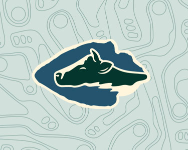
The refreshed logo embraces simplicity, versatility, and historical relevance. At its center is a bold, graphic cow’s head parting water, framed within an arrowhead shape—a subtle nod to the Native American heritage of the area. This modern mark reflects the meaning behind the name “Cowford,” which originates from the term “place of cow’s crossing,” a reference to the narrow section of the St. Johns River where cattle once crossed. A strong, athletic style typeface supports the new logo, offering a timeless and sporty appeal. The result is a clean, iconic brand that honors the history while functioning effectively across apparel, merchandise, and digital media.